Ludus just got its very own color picker.
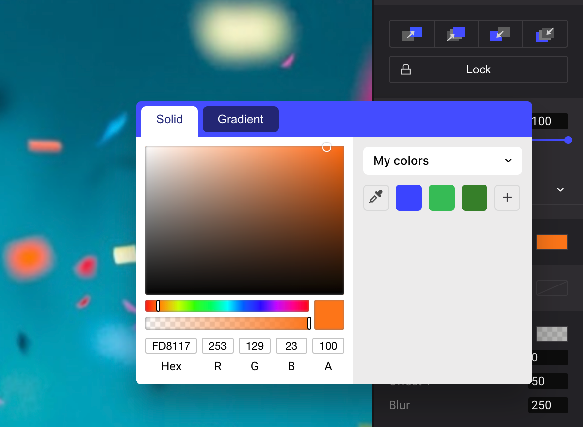
Until now, picking a color in Ludus was only possible with the macOS+Chrome combination, but it was not super handy and not super reliable (especially when you add profile colors to the equation). Therefore, we decided it was time to develop our own. And here it is, in all its glory!
How to use it?
You can access it in two ways: from the color panel, clicking on the little icon meant for that purpose and changing the related property (fill, stroke, shadow or color overlay), or just by pressing “i” on your keyboard (in that case, it takes the fill property by default).
You’ll notice we added a magnifying preview on the top right corner while using the eye dropper, so you can select the exact pixel you are looking for (we know you’re that maniac).
The magnifying preview in action.
There is no better time to start managing your colors
As we are talking about colors, it’s a good time to remind you about how the color library works in Ludus. Everything happens in the color panel (it’s the same for all color-related properties: fill, stroke, overlay or gradient).
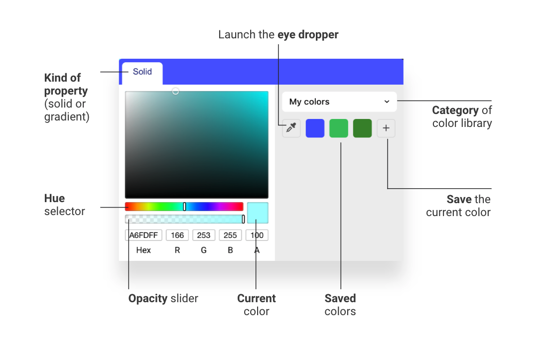
Anatomy of the color panel.
The key thing to comprehend is the dropdown which selects the category of the color library. It has 3 possible values:
1. My colors
These are all the colors you saved in your account. They will be there until you remove them (by using Alt+click on the undesired color).
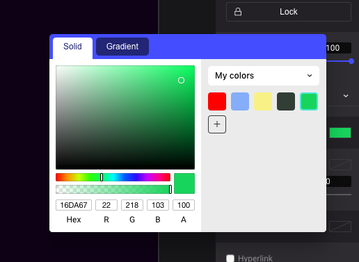
The colors you saved for yourself.
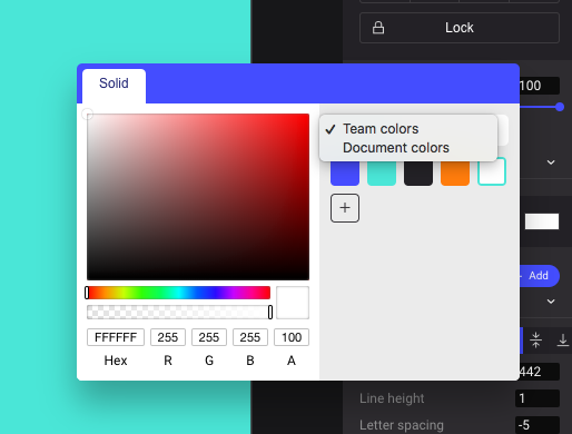
2. Team colors
If you’re in the context of a team, these are the colors you and your teammates saved. This means your whole team can access them, not only you. As mentioned above, these colors will remain there until you or someone of your team decide it’s time for them to go.
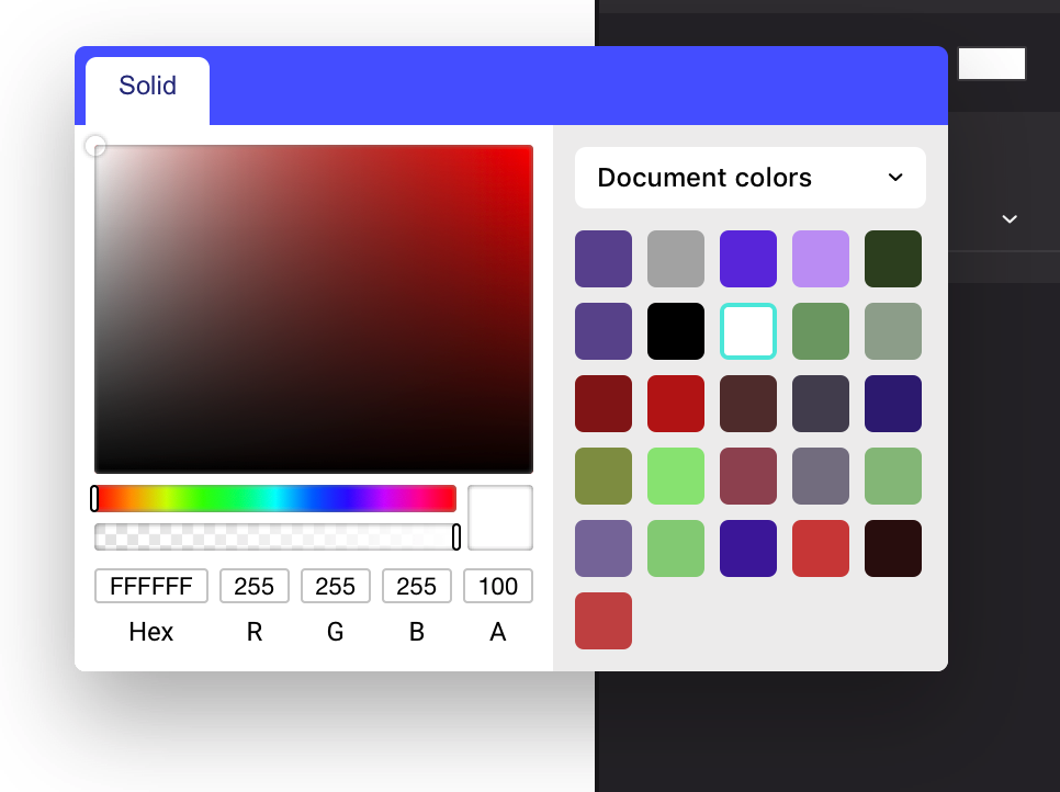
3. Document colors
These are basically all the colors used in the currently open document. Personal or team colors will also be there, but here, you can’t remove a color from the panel as the list is dynamically populated (it’s based on the object colors in all the slides of the current presentation).
It can be quite helpful as you won’t save a color that you know will only be used in the current presentation.
It’s also a good way to check if you (or your teammates) didn’t go crazy with too many different colors in the same presentation, which is probably not a good thing from a design point of view 🤓
As always, contact us if you have any feedback or ideas. We hope this kind of little improvements will help you work faster!