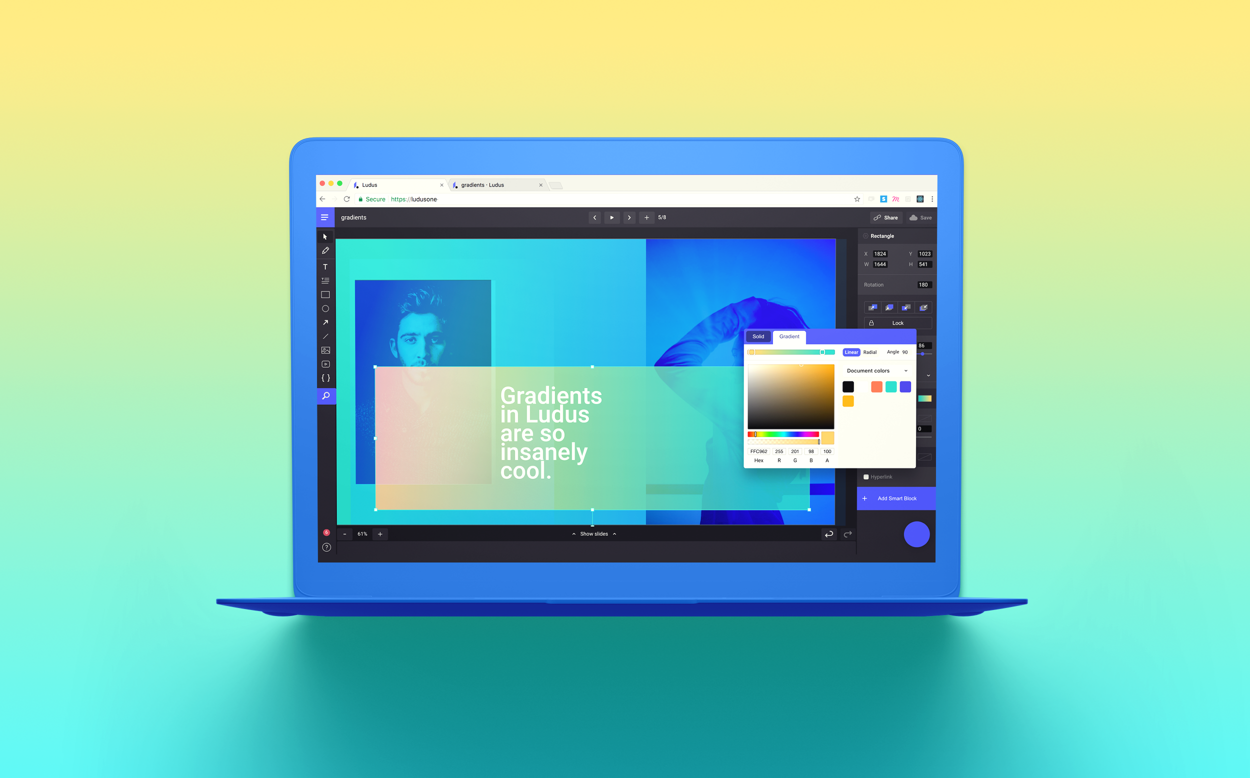
Gradients are here!
Another popular request has now become a reality and we are pretty sure that you will use this a lot in 2018!

Did you know gradients are definitely trendy in 2018?
- 99designs explains it by pointing that flat design is evolving, and the come-back of gradients is an evolution of flat design, often referred as “flat design 2.0” or “semi-flat design”.
- MereHead points that large companies and brands paid attention to gradients because brands are always trying to stand out on the Internet and gradients have been helping them a lot.
- Venngage says gradients will be literally everywhere, from websites to Twitter headers, and even presentations. And if you still need to be convinced, go here or there for more information and inspiration.

With Ludus, applying a gradient is the simplest thing ever. The color picker now has two tabs: “Solid” and “Gradient”. The former is what you choose if you want to set a single color on an object (the only option you had until now) and the latter is the novelty we are talking about here. You can choose between a linear or a radial gradient and move the cursors to adjust it to your preference. If you choose to apply a linear gradient, you can also set an angle if you want to do fancy things like oblique gradients.
I see you giving me a dubious look but we can accomplish great things with gradients. Here are a few slides to illustrate it:
Gradients are great when you have no ideas of what put in the background of your slide. It can bring life to boring slides, and it can help you in many more ways.
You can apply a gradient on icons or shapes (from Illustrator or Sketch, read our article about this), so it can become part of your brand identity. As you define brand colors, you can define “your” gradients as well. Using gradients with blend modes on top of images can help give a sense of unity to very different pictures. It’s an easy trick used widely by many famous brands (like Spotify or Asana).

It’s also very cool to play with the alpha channel of one of your gradient colors. It can let you create a subtle mask on top of a busy background.
On a radial gradient, the alpha let you blur the edges of your circle. In the example slides below, we used this technique to draw little clouds. Clone the presentation to see how it’s build. That’s pretty easy, and it’s just one example.
We hope you’ll enjoy using gradients. If you have ideas on how to improve this feature, you know you can reach us directly from the app or via email. For those of you who still don’t know Ludus much, it’s free, fun and sexy, so go get it! It’s now or never! :)